Throughout my professional journey, whether I was navigating operational challenges, improving patient flow, or solving quality issues, I kept coming back to a handful of problem solving tools that consistently delivered results. These tools didn’t just offer solutions—they provided clarity. They brought structure to chaos, insight to data, and most importantly, actionability to problems.
Here’s a breakdown of the Top 10 problem solving tools and concepts that have helped me solve 90% of the problems I’ve faced:
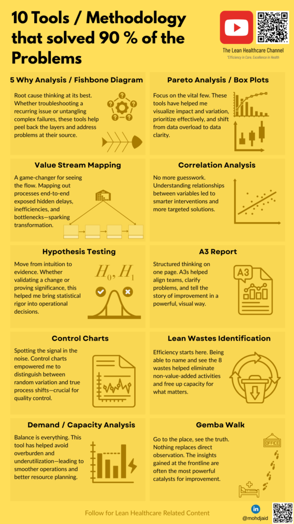
5 Whys Analysis
When something went wrong, this simple yet powerful technique helped me peel back the layers and get to the root cause—without jumping to conclusions. Often used with Fishbone Diagrams, it encouraged deeper thinking and better solutions.
When to use it: Immediately after a problem is identified and before proposing solutions.
What it does: Helps you dig deep into the root cause instead of treating symptoms.
Example: In one instance, we kept experiencing repeated delays in surgical prep. The initial “why” pointed to missing equipment. Going deeper revealed poor replenishment triggers and unclear ownership of the checklist.
Tip: Use the Fishbone Diagram to visually categorize causes under People, Process, Equipment, Environment, etc.
Pareto Analysis
The 80/20 rule proved true more often than not. Using Pareto Charts (and often enhanced with Box Plots), I was able to pinpoint the few causes driving the majority of issues—helping prioritize effort for maximum impact.
When to use it: When you have multiple contributing factors and need to prioritize.
What it does: Identifies the “vital few” causes that contribute to most of the outcomes.
Example: In inventory optimization, Pareto charts helped us focus on the 20% of SKUs that caused 80% of stockouts. Box plots further helped visualize variations in delivery times across vendors.
Tip: Use Pareto early in problem-solving to avoid spreading efforts too thin.
Value Stream Mapping
This tool transformed how I viewed processes. Mapping the entire flow helped identify delays, redundancies, and bottlenecks. It made waste visible and improvement opportunities obvious.
When to use it: During process redesign or when improving flow from start to finish.
What it does: Visualizes every step in a process, helping distinguish value-adding from non-value-adding activities.
Example: In patient discharge, mapping revealed that 30% of the total time was lost waiting for transport and documentation.
Tip: Always map the current state first, then move toward the future state.
Correlation Analysis
When exploring performance trends, outcomes, or process factors, correlation charts helped me connect the dots—often revealing relationships that weren’t immediately visible through basic metrics.
When to use it: When exploring relationships between two variables, especially in metrics or outcomes.
What it does: Shows whether variables move together, helping inform cause-effect exploration.
Example: We suspected a link between nurse-patient ratio and readmission rates. Correlation analysis confirmed a strong relationship, supporting a case for staffing changes.
Tip: Correlation ≠ causation—use this as a lead-in to deeper analysis.
Hypothesis Testing
This tool sharpened my decision-making. Whether it was testing a change in protocol or validating a process tweak, using structured experiments ensured we acted on evidence, not just intuition.
When to use it: When you’re considering a change and want to validate its impact.
What it does: Helps you test assumptions with data, reducing the risk of false confidence.
Example: We introduced a change in medication administration timing. Using hypothesis testing, we confirmed that error rates dropped significantly post-intervention.
Tip: Choose the right test (t-test, chi-square, etc.) based on your data.
A3 Report
The A3 format forced clarity. It condensed thinking into a single page—defining the problem, current state, analysis, action plan, and results. It aligned teams and made improvement work transparent.
When to use it: For documenting structured problem-solving, aligning teams, or presenting improvements.
What it does: Forces clear, concise storytelling—from defining the problem to executing the plan.
Example: We used A3s to drive a hospital-wide initiative to reduce patient falls. The format helped consolidate root causes, actions, and impact—all on one page.
Tip: Build it iteratively with team input; don’t just treat it as a form.
Read about A3 Report
Control Charts
These statistical tools helped distinguish between normal variation and real change. They kept teams grounded, ensuring we didn’t overreact to noise—or miss a true signal.
When to use it: When tracking performance over time and distinguishing normal variation from special causes.
What it does: Helps prevent overreaction to routine fluctuations and focus on true changes.
Example: A lab turnaround time dashboard showed erratic spikes. Control charts revealed most were within control limits—only two instances required intervention.
Tip: Combine with a Run Chart if you’re still establishing your baselines.
Lean Waste Identification
Learning to see the “8 Wastes” (like overproduction, waiting, motion, etc.) changed how I looked at every process. It made inefficiency visible, and thus, solvable.
When to use it: When aiming to improve efficiency, eliminate delays, or reduce costs.
What it does: Provides a lens to identify non-value-added work across 8 waste types (e.g., motion, waiting, defects).
Example: During a Gemba Walk, we observed nurses walking long distances for supplies—clearly a waste of motion and time.
Tip: Look for waiting, overprocessing, and inventory waste especially in healthcare and logistics.
Demand / Capacity Analysis
Especially in resource-constrained environments, balancing workload against capacity was critical. This tool helped us redesign shifts, redistribute tasks, and reduce stress—without compromising outcomes.
When to use it: When there’s a mismatch between workload and resources.
What it does: Helps ensure you have the right people, space, or equipment to meet demand reliably.
Example: Our radiology department faced long appointment delays. Analysis showed that demand regularly exceeded capacity on 3 out of 5 weekdays. This supported a case for load balancing and extended hours.
Tip: Visualize this with heat maps or simple bar charts across time intervals.
Gemba Walk
Perhaps the most powerful of all—going to the place where work happens. Observing firsthand, listening without bias, and asking questions at the frontline always revealed the real story.
When to use it: Early in any improvement journey—or when reality doesn’t match reports.
What it does: Promotes firsthand observation, respectful inquiry, and real-time insight.
Example: During a morning walk in the emergency department, it became clear that bottlenecks were due to EHR login delays—not process issues as previously assumed.
Tip: Go with humility, ask open-ended questions, and listen more than you speak.
Problem Solving Tools – Takeaway
These problem solving tools don’t work in isolation—but when combined thoughtfully, they become a problem-solving powerhouse. They’ve helped me move from reacting to symptoms to solving at the source, from guessing to knowing, and from frustration to focus.
🔄 The tools aren’t new. But the discipline to use them consistently is what drives transformation.